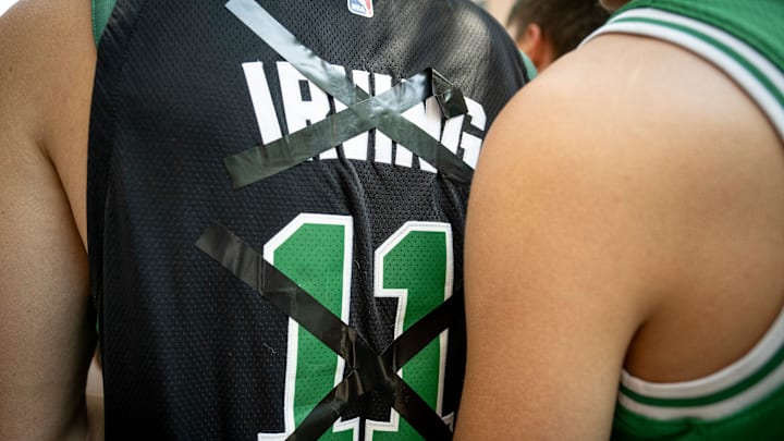
Every year, Nike released special jerseys for every team called the City Edition jerseys. For teams like the Miami Heat, these have been a massive hit. But for the more traditional franchises like the Boston Celtics, most of the jerseys have been a complete whiff.
Well, the Celtics’ 2024-25 City Edition jerseys were recently leaked on Twitter, and they are a complete mess once again. They are very simple, but they just don’t hit the mark of what a great City Edition jersey should be. The black is fine, but the dark and light green combination is dull, and the colors don’t mesh well.
In fact, they missed the point in three monumental ways.
1. Celtics fans don’t want to break the norm
First and foremost, the Celtics are one of the most traditional teams in the league. Very few fans want them to stray too far outside of their comfort zone, which is exactly what these jerseys do.
BREAKING:
— CelticsMuse (@CelticsMuse) September 17, 2024
The Celtics 2024-25 City Jerseys have leaked
Thoughts? 🤔 pic.twitter.com/WcBenHHNBr
A giant collective of Celtics fans believes their team has the best jerseys in the league with the simple home whites and road greens. So, anything outside of those two kits is often considered a bad look.
Using that as a guideline, they should look to keep all of their City Edition jerseys super simple, adding only a hint of gold or a bit of black to their normal jerseys. Anything that strays too far from the norm will be a huge whiff for a ton of fans.
2. The jersey wasn’t unique enough
If Nike decides to get away from the traditional jerseys that make the Celtics who they are, then they have to go for it. They can’t play in the middle and hope people latch on to whatever they put out. Either play it completely safe or go all the way.
This jersey is completely dull. It’s similar enough to the regular jerseys that Boston should just wear their normal uniforms every night but different enough that the traditionalists will dislike it.
Somehow, Nike managed to find the perfect way to sit on the fence, and that’s the worst place to be.
3. They didn’t let Pete Rogers design it
This is the key to everything. For the past two years, Pete Rogers has been designing a new Celtics jersey every time the team wins a game. And they are amazing.
He’s designed uniforms based on Dunkin’, the Rainbow Swash, and Mike Gorman. Yet every year, the same designers at Nike pump out middle-of-the-pack jerseys to place on one of the most iconic sports teams.
The answer is simple: Let Pete Rogers design the Celtcs’ City Edition jerseys. Or at least consult him on the matter. The guy is a genius.
