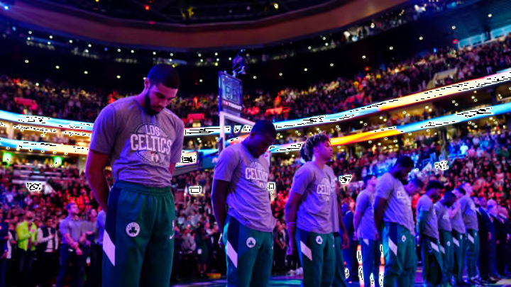
Boston Celtics: B/R seemingly on the fence in regard to C’s new look
By Mark Nilon

Since the design for the 2020 ‘City Edition’ jersey for the Boston Celtics was released to the public, it has caught the attention of the team’s fanbase. B/R recently chimed in with their opinions on the new threads.
Though the roster for the Boston Celtics may be looking pretty good heading into the 2020-21 season, their newest style does not — that is, according to some of those within the media.
Since Nike partnered with the NBA to design the league’s uniforms back in 2017, they’ve instilled a special twist within each team’s wardrobe called ‘City Edition’ jerseys, which manage to incorporate some kind of element from either a specific team’s city, community, franchise history or something else of that ilk.
With this new trend has come a significant uptick in jersey sales, but also has had varying reactions from team’s fanbases over the years.
Recently, Bleacher Report swung into action, subjectively ranking each organization’s City Edition threads and, in said rankings, placed the Boston Celtics somewhere within the middle of the pack — 19th to be exact.
Writer Sean Highkin went on to praise the team for straying away from their usual color concepts but took some points away for their final decisions on the font placement.
"They should treat their green and white like the Yankees treat their pinstripes, which haven’t changed in 100 years. Those are the only two colors the Celtics need.The concept here is solid—it’s an homage to the championship banners they have hanging in the rafters, of which they claim to have more than any other franchise (if you want to re-litigate the Lakers’ Minneapolis-LA divide).The problem, however, is the decision to go with two lines for the writing on the front. These would rank at least 10 spots higher if they made a choice between “BOSTON” and “CELTICS.” Trying to have both just makes it too busy."
Personally, the Houdini is a big fan of the design the team chose, and will likely look to purchase one in the coming weeks — a Jaylen Brown jersey, specifically, as he is just simply one of my favorite players in the league and looks to be on the brink of superstardom.
That said, we have seen MANY fans within the Twitterverse take jabs at the design, with one hilarious statement going as far as to ponder on the question as to “when did the Celtics partner with Whole Foods?”
All in all, the design of a team’s jersey does not matter but, rather, the talent in which dons them. Luckily for Celtics fans, there is no debate as to where they rank in this category, for they place amongst the best of them.
dark. Next. 2 wings Cs could pursue with veteran’s minimum